
People use many different devices today to interact with brands digitally. Market research shows that there are more mobile users than non-mobile, and this gap continues to expand. Ensuring that your website is built in a way that satisfies and informs both mobile and desktop users is becoming increasingly important as more and more people are accessing the internet from their mobile devices.
Consumers and businesses are expecting just as much ease of navigation on websites accessed with their smartphones and tablets as they do on their PCs. Ensuring that your website is as easy to navigate and as functional for mobile users as it is for desktop users will ensure potential leads don’t leave your website because they find it difficult to interact with and will stay on longer and find your content useful and engaging.
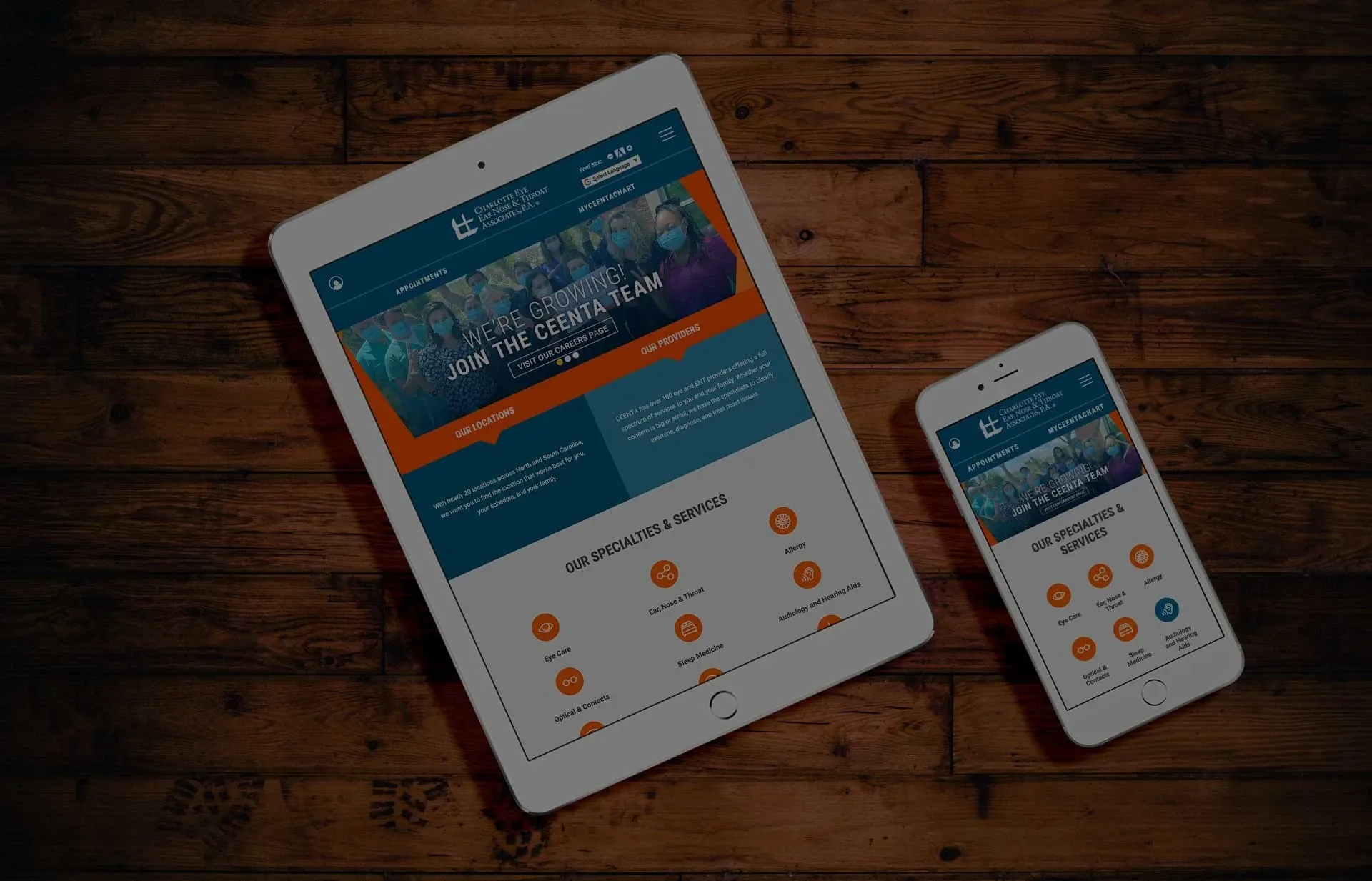
Taking a mobile-friendly approach and using responsive web design allows your website to adapt to the size of the current screen it is being viewed on. Whether someone is opening your website from a laptop, tablet, or smartphone, using a responsive web design guarantees uniformity and consistency in the way your website is displayed. This design reformats the page to give users a stronger experience that is better suited to their device. Mobile-friendly web design also makes your site easier to interact with by incorporating functionality like touch screen and unique mobile navigation. This approach ensures your website is optimized per user, no matter what device they are using to interact with it. This will provide a more positive, compelling experience to users, leading them to engage with your content rather than look elsewhere.
Using mobile-friendly web design, you can also ensure you are fully harnessing traffic coming to your website from social media. Studies have shown that more than 55% of social media consumption now occurs on mobile devices. Sharing links from social media sites that route to your website will increase traffic and engagement. Using a mobile-friendly design also can improve your SEO. Per Google, responsive websites outperform nonresponsive websites in search engine ranking because they provide a better experience than sites that are not mobile-friendly. Mobile phones now have a separate Google search algorithm, so just because a website ranks high in SEO for desktop doesn’t guarantee it will rank as well for mobile, making the mobile approach even more critical.
« Back to Blog
Ready to Get Started? Contact Us Today to Schedule a Consultation.
© 2024. All rights reserved. E-dreamz, Inc.